Determining the Right Amount of Product Photography for Your Needs
| Shelf | Photo Techniques |
|---|---|
| Date in | |
| Readers | 571 |
Understanding how many product photos you need is key to effective marketing; three to seven images can enhance customer confidence without overwhelming them.
One frequently asked question in the world of product photography is: “How many product photos do I actually need?” The straightforward answer is that it varies, but it's often less than what many brands assume.

Some companies believe they need to showcase 20 images of every product, while others think just one photo will suffice. The reality lies somewhere in between. My emphasis isn't on inundating you with as many images as possible, but rather on providing the right images that truly serve your customers' needs.
Establishing a Minimum Requirement
At its most basic level, only one image is technically necessary to sell a product. But would I recommend this approach? Absolutely not. If your budget allows, I suggest aiming for at least three images per product.
Three images can give potential buyers a better understanding of what they're purchasing, showcasing different angles and features without necessitating a large financial investment. However, if your aim is to build a more robust ecommerce presence, I typically recommend featuring seven images per product.
Keep in mind that this count excludes images for homepage displays, hero banners, and other marketing visuals, which serve distinct objectives.
The Rationale Behind Seven Images
While seven may not be a magical number, it's the point where most of your customers' questions are adequately addressed without causing cognitive overload. Over the years, I've discovered that simply having more images doesn't guarantee increased sales.
Shoppers today are busy and often impatient. It's unlikely they will scroll through 20 photos of the same product. Instead, seven images tend to strike a balance, effectively building confidence, telling a story, and guiding customers toward making a purchasing decision.
Crafting the Ideal Product Page
When organizing a photoshoot, I structure my planning around how these images will contribute to the product page.
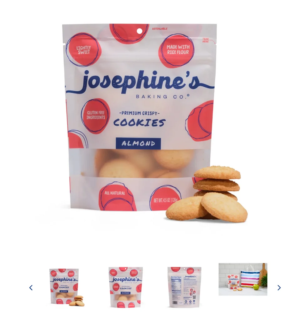
I always start with one to three ecommerce images. These are typically clean, professional photos against a white background, clearly displaying the product. This initial focus is intentional; modern consumers have grown accustomed to this format, thanks to major retailers like Amazon. They expect straightforward, clean imagery before delving into more detailed aspects.
Offering this uniform experience across your website ensures that as customers navigate from one product page to another, they encounter a familiar and organized layout. Following the ecommerce images, I recommend including four lifestyle images next.
Lifestyle images serve to illustrate your brand story. They showcase your product in action, create emotional connections, highlight intricate details, and help customers visualize using the product themselves. This combination of seven total images helps create a cohesive product page that is both informative and succinct, preventing the need for endless scrolling.
The Importance of Consistency
A common pitfall is when brands focus too heavily on the quantity of photos instead of whether the imagery works together cohesively. I'd much rather see seven cohesive images than a disjointed collection of 20. A product may be photographed by different photographers, in various locations, or even taken on a smartphone.
Individually, these images might be fine, but collectively, they can create an inconsistent brand experience. Different lighting, editing styles, and backgrounds can collectively lead to a disjointed appearance across your ecommerce platform, undermining customer trust. Though they may not articulate why they feel this way, customers inevitably sense inconsistency.
Homepage Considerations
Another aspect often overlooked is homepage imagery. Brands frequently allocate substantial time and effort to product pages, neglecting to consider the critical first impression made by the hero image on the homepage.
Your hero image shouldn't just be visually appealing; it must work in harmony with your headline, copy, and call-to-action. I’ve seen beautiful photos that fall flat once text is superimposed over them. When planning homepage photography, I consider where the text will be located and how the image will support the overall message.
My Recommendations
If you're trying to determine how much product photography you actually need, begin by asking not how many images fit your budget, but rather what your customers need to see to feel confident in their purchasing decisions.
For most brands, this generally means:
Three images if you're working with a limited budget.
About seven images for a complete product page.
Tailored homepage and hero images that reinforce your brand messaging.
A consistent visual style throughout your product catalog.
The objective isn’t to fill a gallery; rather, it’s to create an experience that facilitates seamless shopping.
Final Thoughts
As a product photographer, I’ve learned that impactful product photography isn't solely about amassing the largest collection of images. It’s about strategically developing the right images at the right time. When every image serves a purpose, your website appears more professional, customer shopping becomes easier, and potential buyers feel more confident hitting that "Add to Cart" button. That’s the goal we should always aim for.