Navigating the Complexities of Color-Negative Film Comparisons
| Shelf | Cameras & Lenses |
|---|---|
| Date in | |
| Readers | 697 |
Understanding the challenges of color-negative film comparisons is key to making informed choices in photography and filmmaking.
This month’s newsletter is a bit delayed—blame it on my camping trip!
Summer has been eventful, filled with excursions across British Columbia alongside numerous experiments with film stocks. While I’m working through write-ups on various new film stocks I tried, I’ve also been testing new cameras. Look forward to upcoming podcast episodes detailing my experiences. One project I tackled pushed the limits, involving shooting 16 rolls of film in just two hours—I’ll share more about that soon.
In this issue, I want to dive deep into the intricate nature of color-negative films and why distinguishing between different stocks can be incredibly challenging.
Many comparison tests often fail to highlight the actual differences among color-negative stocks. However, with the right methodology and understanding, we can enhance the accuracy of these tests—often requiring us to challenge our preconceived notions.
Let’s break this down.
In this newsletter: Why are film comparisons so hard? Can we edit our film stocks to look identical? What is the point of comparing film stocks? How to make film comparisons more accurate. Support this blog & get premium features with GOLD memberships!
Why are film comparisons so hard?
The primary reason that many film comparisons struggle to pinpoint actual differences between color-negative film stocks is due to a lack of control and misaligned expectations.
If you've ever compared your color film scans with others, tested multiple labs, or scanned film yourself, you likely know the variance in results. The internet receives an influx of posts touting successes in comparing lab scans against personal ones for attributes like color and contrast. However, the disparities in technique often lead to confusion and misinterpretation of films that are readily available.
Here’s why identifying color-negative films precisely can be tough:
1. Identical camera and scanning settings can still yield inconsistent results.
While scene factors can certainly affect the camera meter and light quality, the scanner's interpretation of an image may introduce more significant inconsistencies. Scanners often adjust their automatic exposure settings from frame to frame, which can lead to considerable shifts in the scanned colors.
Once an image is obtained from scanning, the film inversion software interprets the scan's colors. This isn't always straightforward, as the software must adapt to the variant properties of differing emulsions. The absence of transparency from app developers regarding their processes adds another layer of complexity.
Your results may fit your expectations for consistency, but they might not reveal the actual differences between two film stocks. Sampling an orange mask or using features like roll analysis may not eliminate inconsistencies attributed to hidden algorithms that adjust based on image content.
2. Color-negative film is a dynamic medium requiring interpretation.
Harman has publicly acknowledged that their emulsion formula sees changes from batch to batch. Kodak's newer Ektacolor Pro films that follow the Portra line might appear similar on the surface, yet the modifications are tangible, particularly with a noticeably thinner emulsion.
Color film modification can occur during transport or storage, influenced by temperature and other conditions. Even in darkrooms, printers regularly conduct several test prints to refine color outputs for individual frames. Minilab machines use densitometers and sensors to dynamically modify development processes with each new roll.
Despite these challenges, films still possess properties that allow for corrections to achieve consistent appearances—whether through filtered darkroom lighting or digital adjustments. That said, achieving a uniform appearance between different films remains a significant hurdle.
3. Actual differences between films may be marginal yet significant.
Film comparisons that adjust stocks for dramatic visual differences fall flat on validity. Instead, efforts should focus on unifying the colors of the films being compared. Failure to digitally recreate one film's look against another often exposes deeper disparities that withstand varied scanning, printing, and editing processes.
Color film manufacturers aim for high fidelity in color accuracy, leading their products to attempt alignment with human visual perception. Given that human perception does not process all wavelengths uniformly, manufacturers design their technology with complex methods to emulate our visual responses. Despite this, achieving high-resolution image sensors that also resemble human perception presents challenges, yielding no singular solution. Differences in these approaches can be pronounced, lingering even post-editing or alteration during scanning.
At times, variations between films can be marginal, leading you to question whether investing in film A is worthwhile if you can achieve its look from film B through editing.
Can we edit our film stocks to look identical?
The answer mirrors digital photography—it depends.
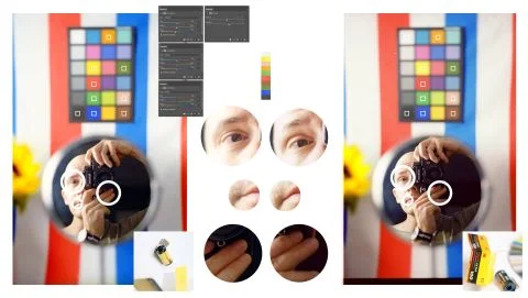
For example, if you adjust shadows, boost saturation, and equalize color casts between Kodak Pro Image and Kodak Ektar (two distinctly crafted emulsions from the same manufacturer), you might fool someone into believing they’re identical on smaller screens.
However, when viewed as high-definition scans, color adjustments that suit one area can easily throw the overall balance off. While I made a decent attempt at matching Pro Image to Ektar, subtle differences in how colors render in these films remain evident.
If you can’t differentiate between the films on your screen, and if that’s your preview medium for displays, you may not need to opt for Ektar at a higher price. But constant editing to achieve a preferred look does require consistent efforts each time.
Some films are so similar that they can resemble each other with minimal edits. For instance, my analysis of Fujifilm 200 and Kodak Gold indicated that their primary difference was light sensitivity rather than color nuances.
On the other hand, distinctions between films like Harman Phoenix and the new German ISO 200 color-negative film are notably significant, making it difficult to align their appearances without sacrificing image quality.
What is the point of comparing film stocks?
With hundreds of brands available today, many using materials from just a handful of sources, it can be bewildering—especially for newcomers. Without dedicating time to research, understanding their properties might remain elusive.
Overcoming biases and recognizing the unique characteristics of each film stock allows photographers to appreciate their true value. Feedback from readers indicates that this knowledge has been beneficial, prompting participation and shared experiences.
Some brands have proven to be nearly identical; knowing this can save photographers both time and money. A recent case is Kodak's Kodacolor 200, which has been priced considerably higher than ColorPlus in many shops due to its novelty. However, both are demonstrated to be essentially the same film, with evidence stemming from my tests and comparisons of developed strips.
Others, such as Pro Image 100, Kodacolor 100, and Lomo 100, show close resemblances in color and contrast. Certain scenarios might make these stocks functionally identical, yet differences still help inform choices among them.
Film manufacturers rarely delve deeply into the specific characteristics of their products beyond basic marketing language. Gaining an understanding of these differences empowers creators to enhance their decision-making, allowing for informed artistic choices.
How to make film comparisons more accurate.
Designing effective experiments presents its challenges. There are inherent limitations to the precision of measurements in any comparison, and understanding these constraints is vital for drawing valid conclusions from findings.
For instance, my film comparisons aren’t blinded to eliminate bias—achieving this would require more subjects and resources than available. Even with vigilant efforts, there's potential for some bias in my assessments.
Nonetheless, several controlled factors can minimize bias:
1. Light. Daylight conditions fluctuate in temperature, direction, and intensity, making any non-studio-light comparisons suspect.
2. Lens & camera. Different lenses render color and contrast uniquely, while variable shutter timings could also impact results.
3. Camera settings. Consistency in exposure (aperture & shutter) and focus across compared frames is critical; variations will naturally alter film appearance.
When assessing how films respond to exposure, I generally select -2, 0, +2 (with 0 as the normal exposure against an 18% middle grey card and -2/+2 indicating two stops of under/overexposure). Smaller adjustments may be insufficient to discern meaningful differences.
4. Content. Dramatic differences in subject matter can result in contrasting images. Simply changing one element in the scene might yield varied scanner interpretations of the inverted colors.
Utilizing a color chart or inanimate object typically lacks effectiveness for robust comparisons. Incorporating human subjects often aids in identifying discrepancies in color reproduction, as our eyes detect skin tones remarkably well.
It's also prudent to consider models’ complexions, as this can further influence perceived differences among films.